




Swipe for more →
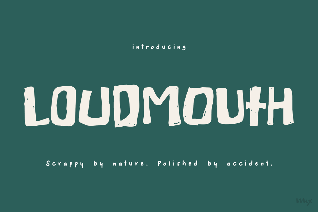
Mix Loudmouth is scrappy. Hand-drawn, rough around the edges, and makes no apologies for either. But set a word in it and something unexpected happens — every letter falls into the next like it was written that way on purpose. Natural and unclean, but somehow still polished.
Each letterform has its own weight and width. Set a word and the letters kern into tight, organic shapes that feel drawn rather than typed. That’s not a feature you turn on. It’s just how it was built.
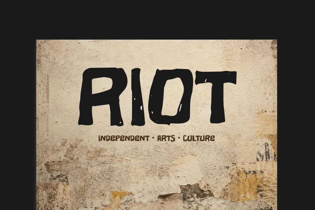
Made for book covers, logotypes, zine titles, greeting cards, and poster headlines. One word, big, center stage.
Includes uppercase, lowercase, numbers, punctuation, extended diacritics for multilingual support, and currency symbols.